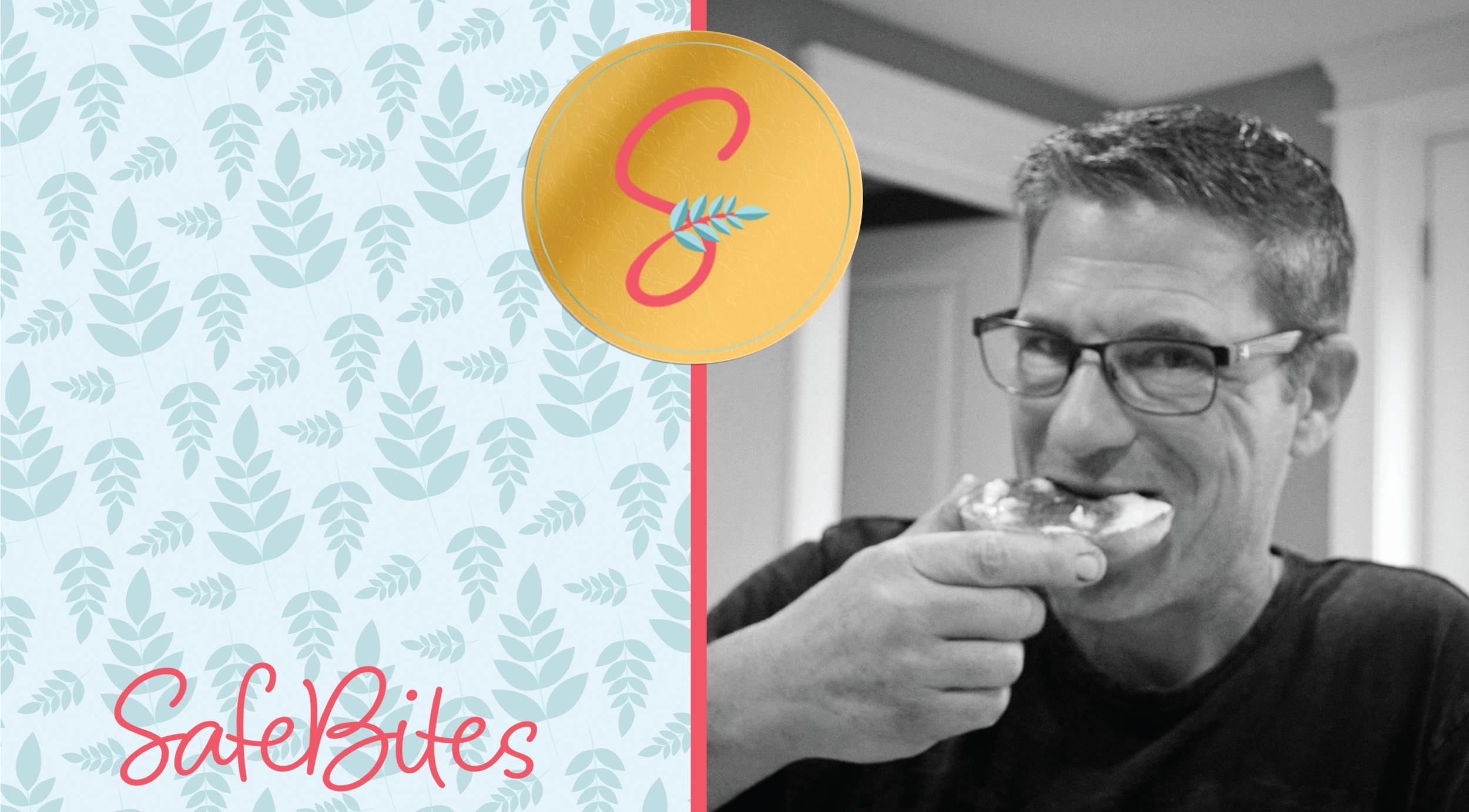
SafeBites
No Grain, No Pain
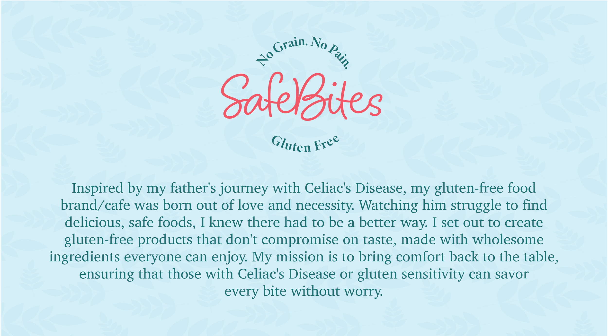
Inspired by my father's journey with Celiac's Disease, my gluten-free food brand/cafe was born out of love and necessity. Watching him struggle to find delicious, safe foods, I knew there had to be a better way. I set out to create gluten-free products that don't compromise on taste, made with wholesome ingredients everyone can enjoy. My mission is to bring comfort back to the table, ensuring that those with Celiac's Disease or gluten sensitivity can savor every bite without worry.
-
![]()
SafeBites
-
![]()
Brand Story
-
![]()
Style Tile
-
![]()
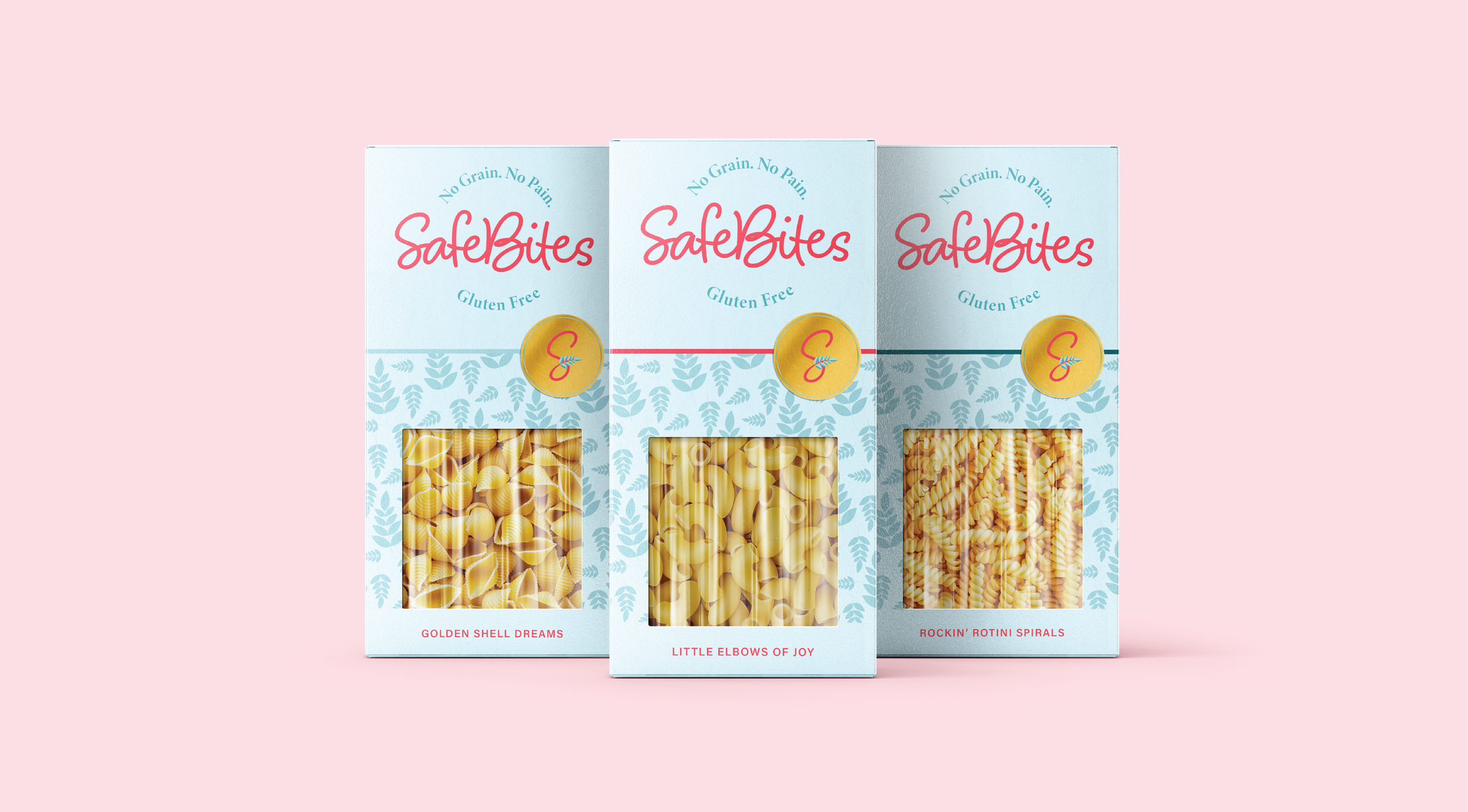
Branding
-
![]()
Branding
-
![]()
Branding
-
![]()
Sticker
-
![]()
Environmental Design
-
![]()
Poster Design
-
![]()
Poster
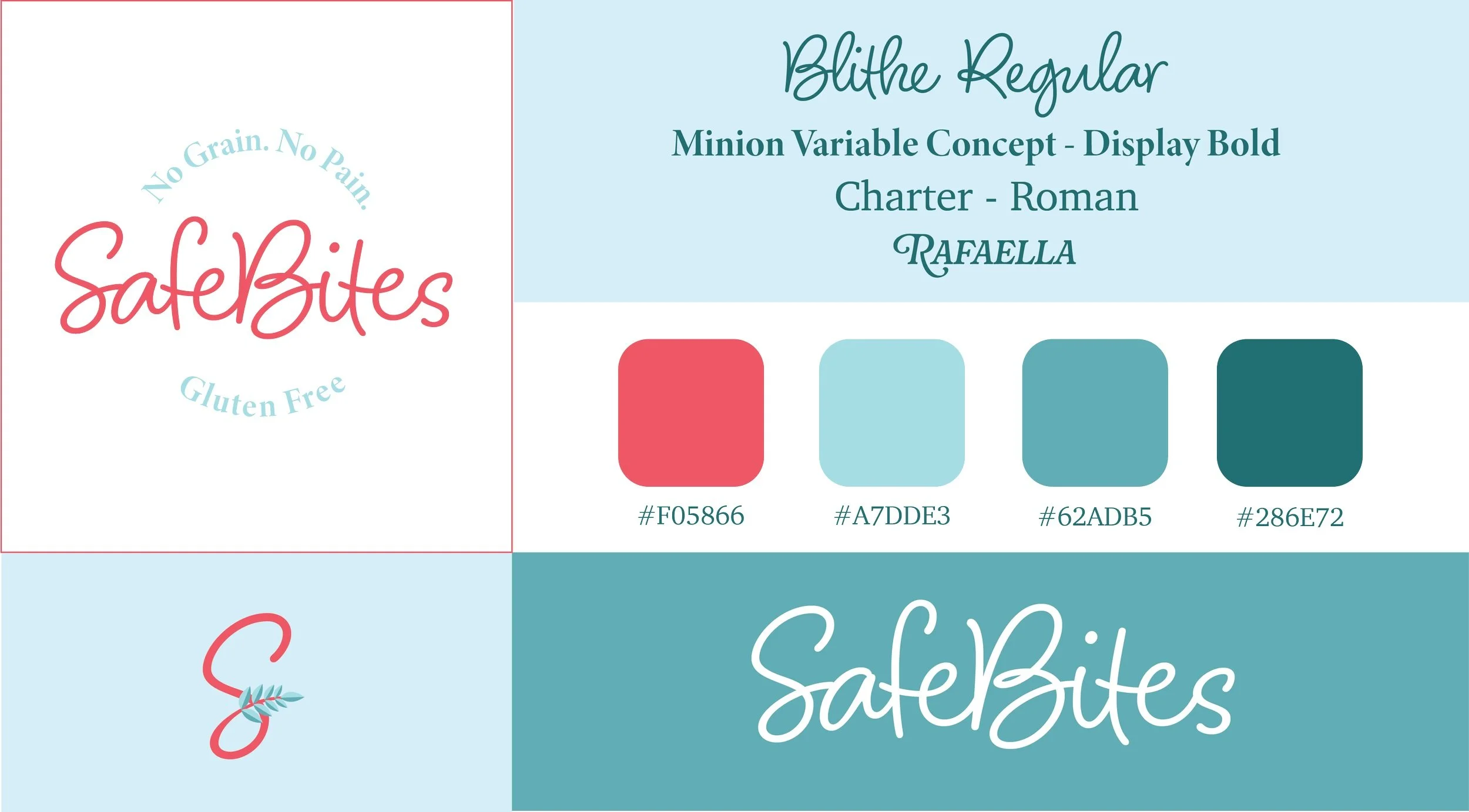


Design Choices
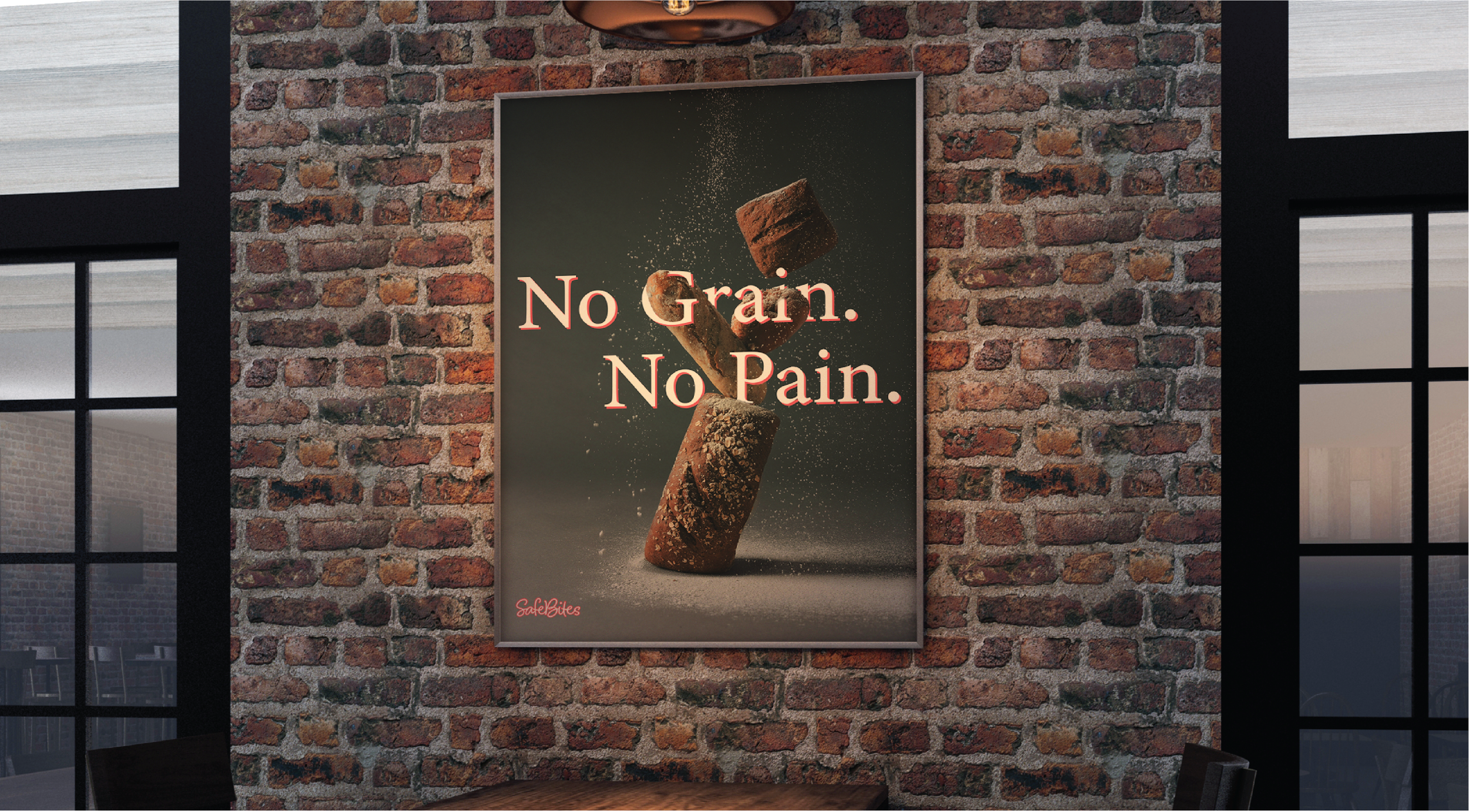
For SafeBites, I wanted the design to feel approachable, trustworthy, and fun, reflecting its mission while still standing out in the market. Every design choice—from the color palette to the typography and patterns—was made with purpose to balance playfulness and reliability.
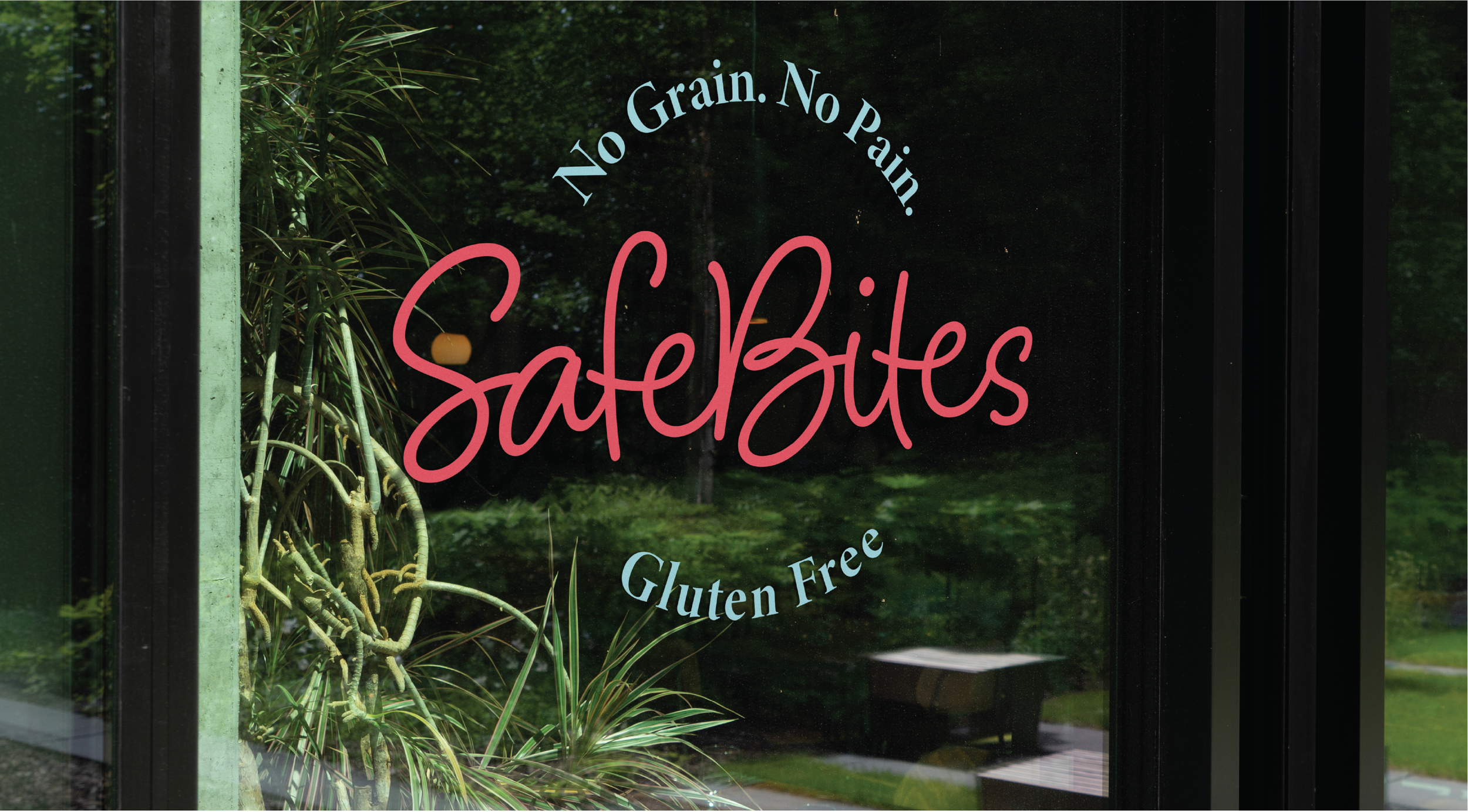
I chose a mix of light blue, dark blue, and pink to create a friendly yet dependable look:
Light Blue conveys a sense of safety, cleanliness, and transparency—important for a brand focused on food safety and allergen awareness.
Dark Blue adds a layer of trust, professionalism, and stability, ensuring that while SafeBites is fun, it’s also credible.
Pink brings warmth and personality, preventing the design from feeling too clinical. It adds a welcoming, friendly touch that makes SafeBites feel inclusive and inviting rather than intimidating.
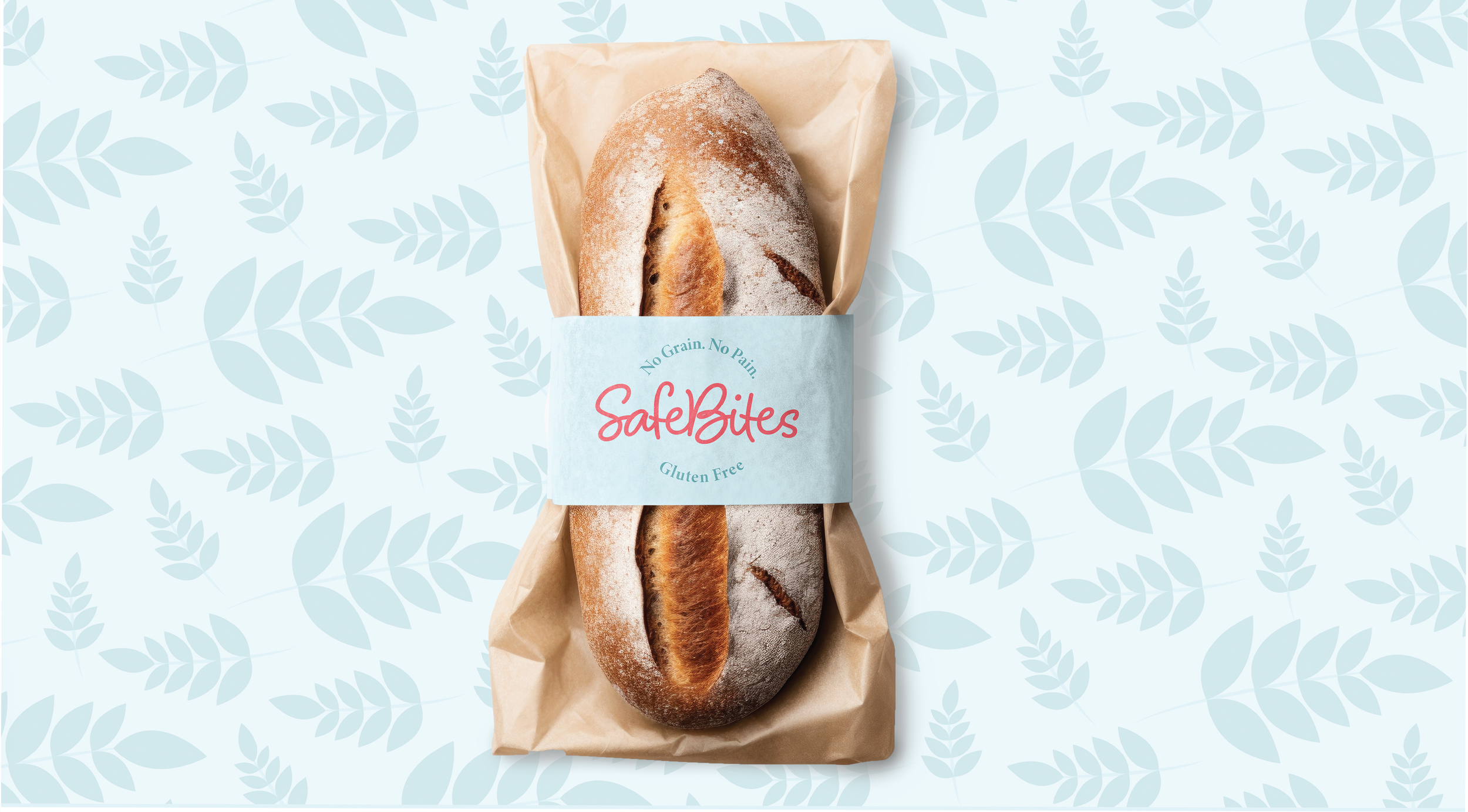
For the pattern, I designed it using wheat elements—a subtle yet intentional nod to gluten and food allergies. Rather than using a generic texture or abstract shapes, I wanted the pattern to reinforce SafeBites' mission visually. The wheat motif creates a recognizable connection to the core issue the brand addresses, while the pattern itself adds a dynamic, organic feel that keeps the design fresh and engaging.
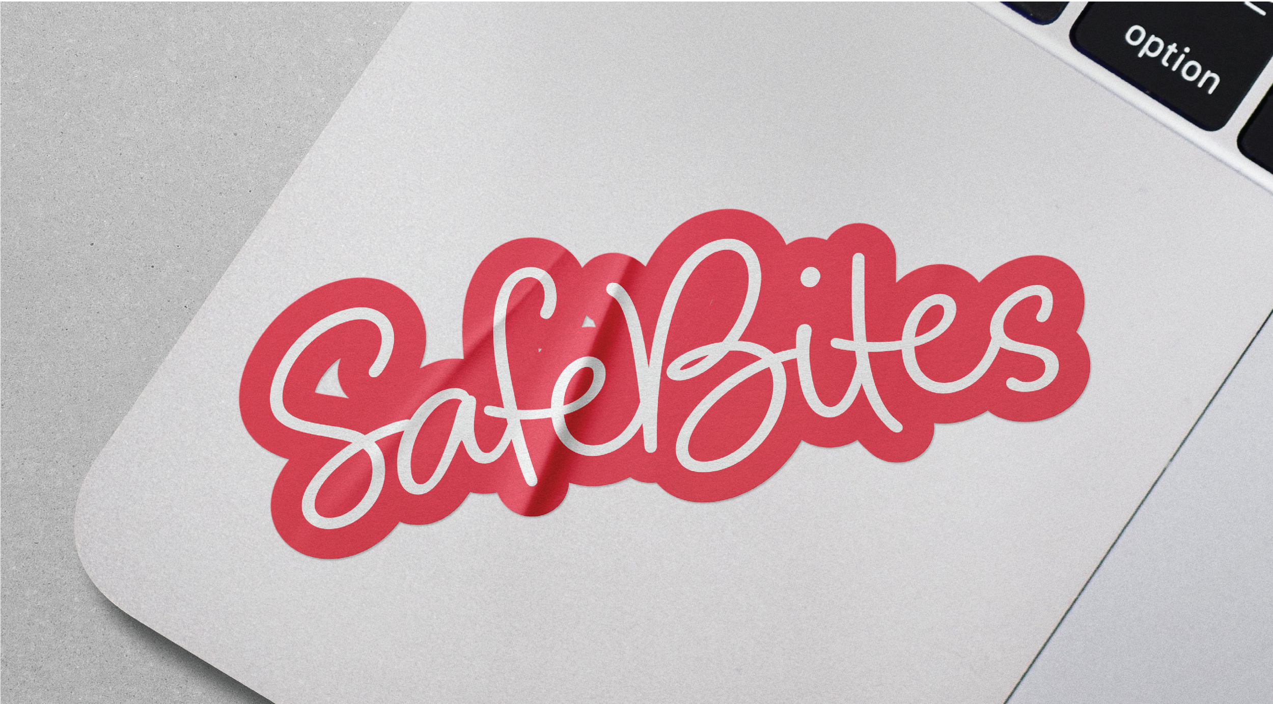
I chose a fun, handwritten-style typeface like Blithe to keep SafeBites from feeling overly corporate or sterile. The casual, script-like lettering gives the brand a friendly, approachable personality, making it clear that SafeBites is here to help—not overwhelm. The typography adds a personal touch, making the brand feel warm, engaging, and easy to connect with.
By combining trustworthy blues, welcoming pinks, wheat-inspired patterns, and fun typography, the SafeBites brand strikes the perfect balance between reliability and approachability. The design ensures that food safety doesn’t have to feel boring or intimidating—it can be engaging, empowering, and even a little fun.