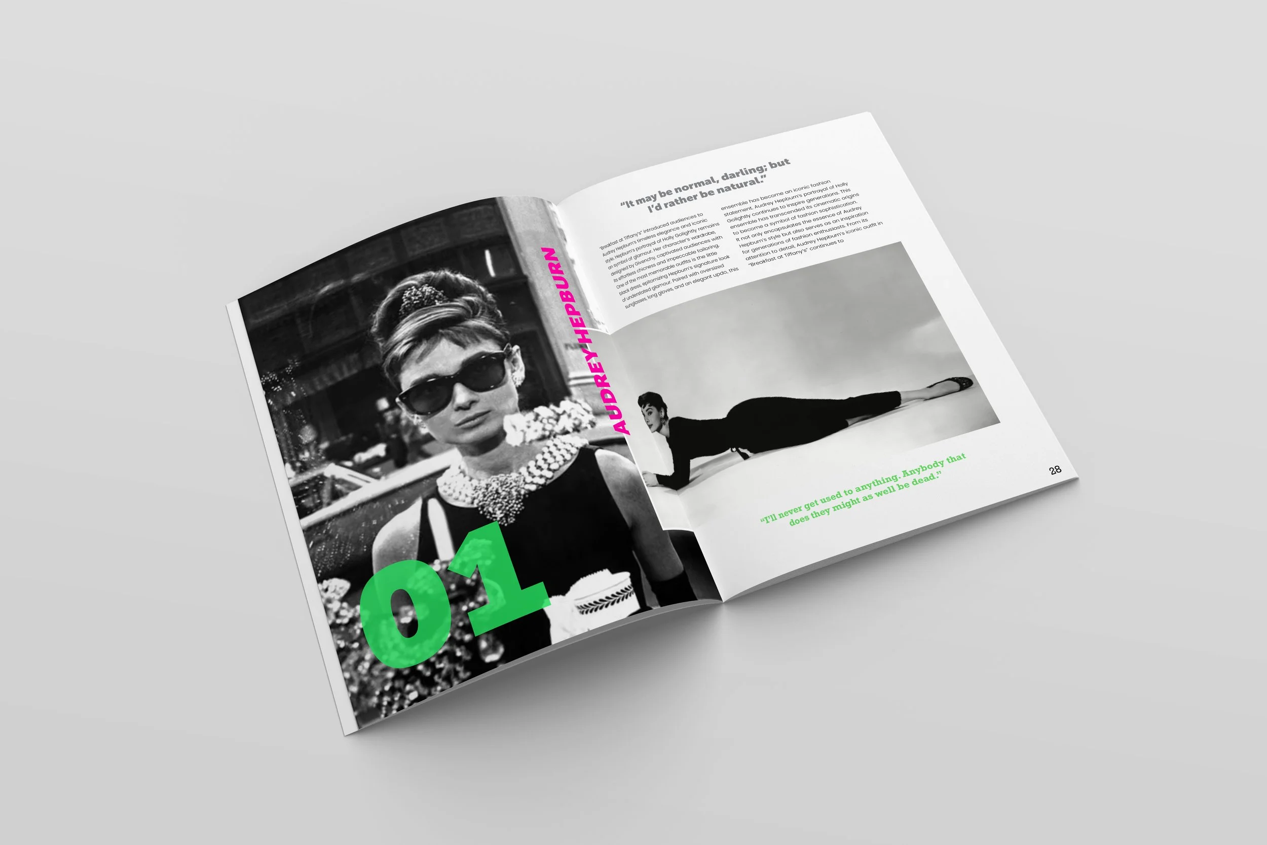
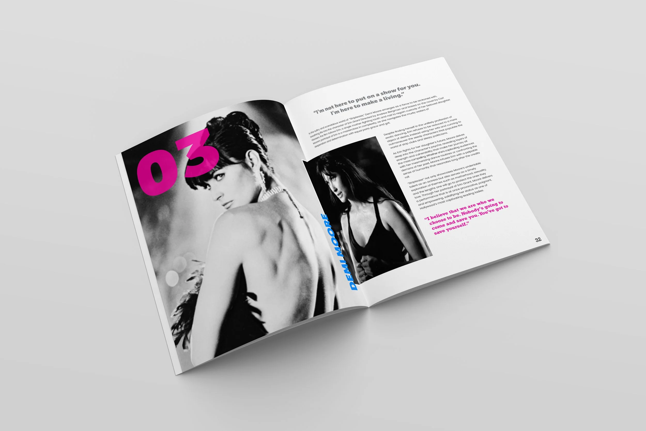
Stitch
Stitch Magazine is a celebration of women in film and the iconic outfits that defined their stories. From the silver screen to modern classics, Stitch explores how costume design shapes character, culture, and cinematic history. Each issue dives into the artistry behind unforgettable looks, spotlighting the designers, actresses, and moments that made them legendary. Whether you’re a film buff, fashion lover, or both, Stitch stitches together the threads of storytelling and style in a way that’s both visually stunning and culturally insightful.

Design Choices
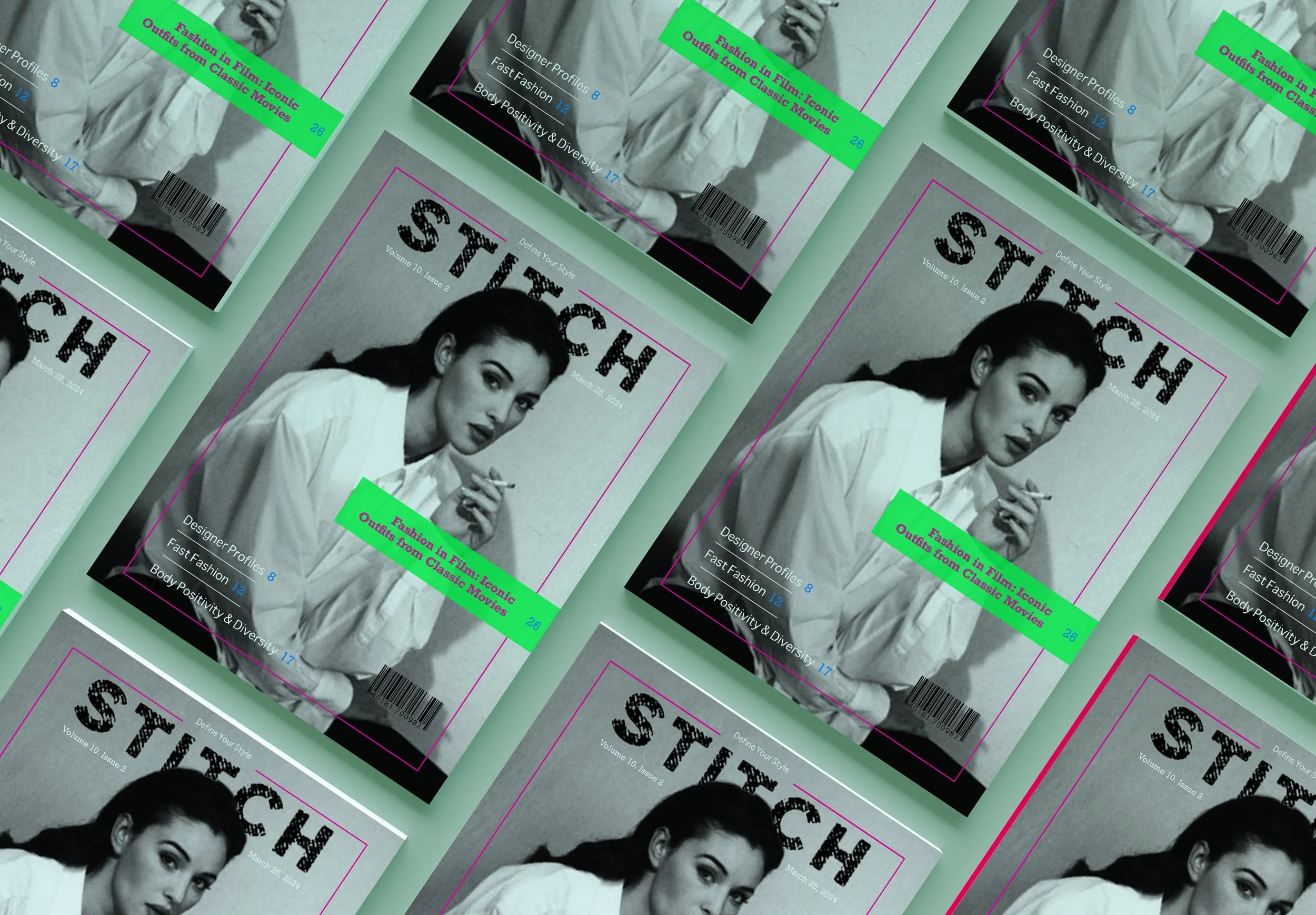
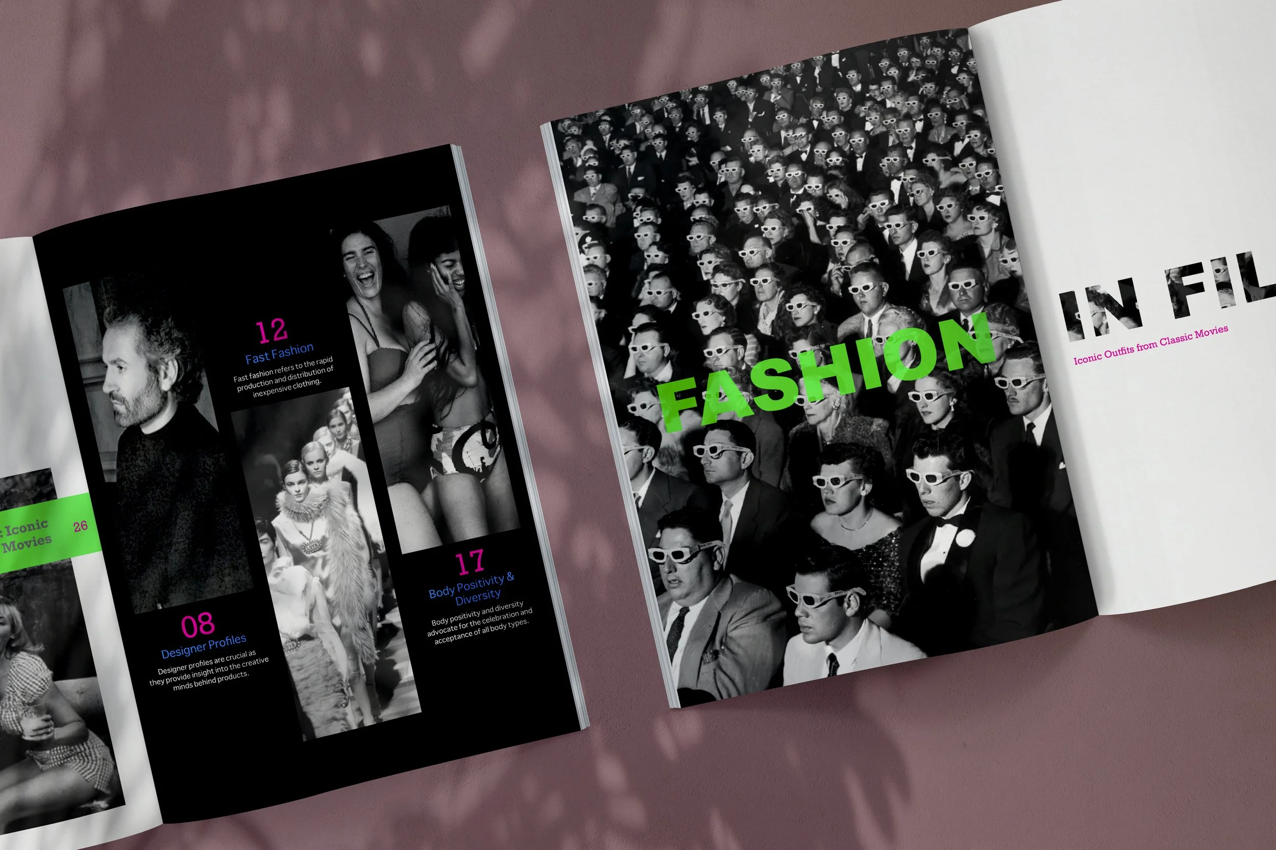
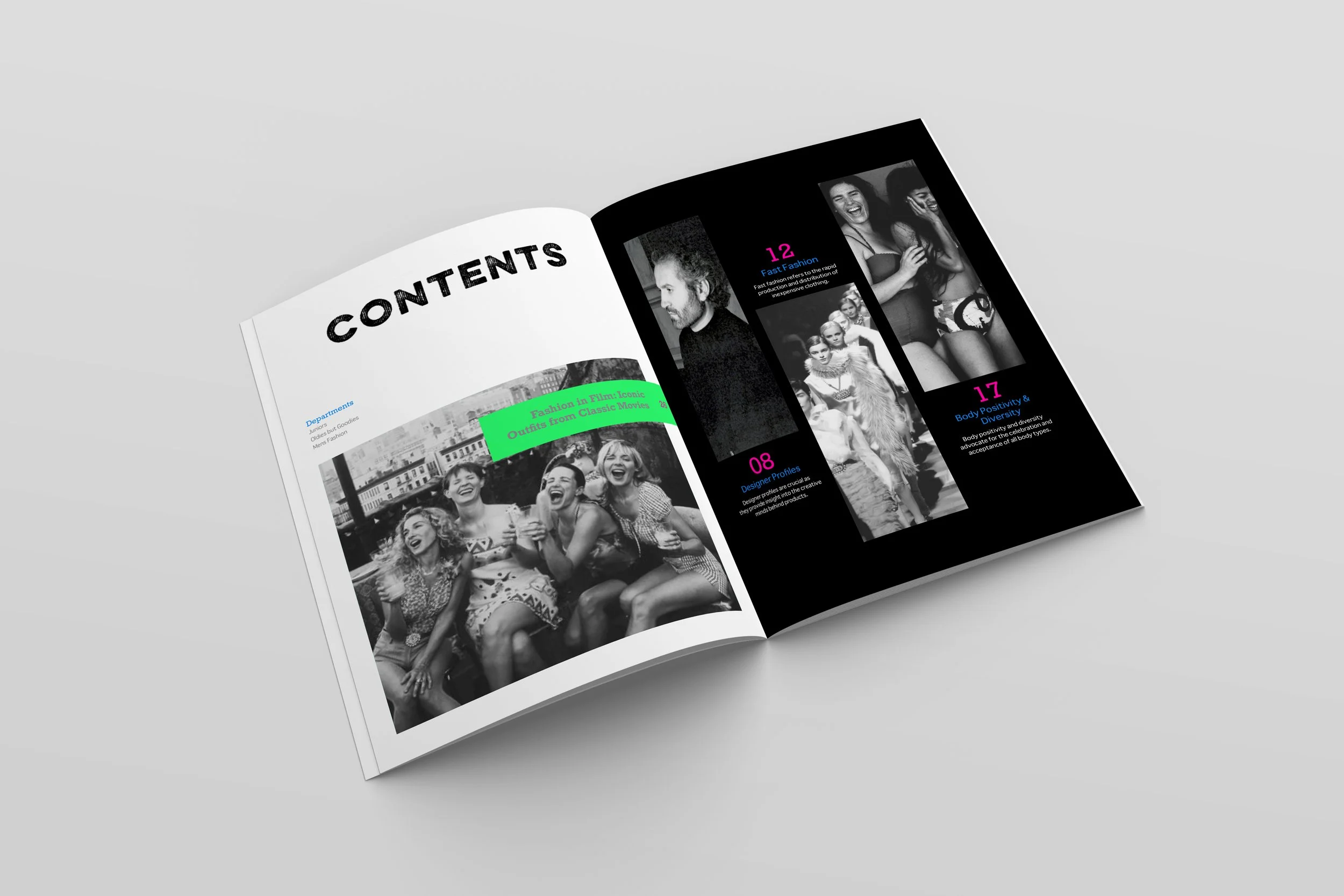
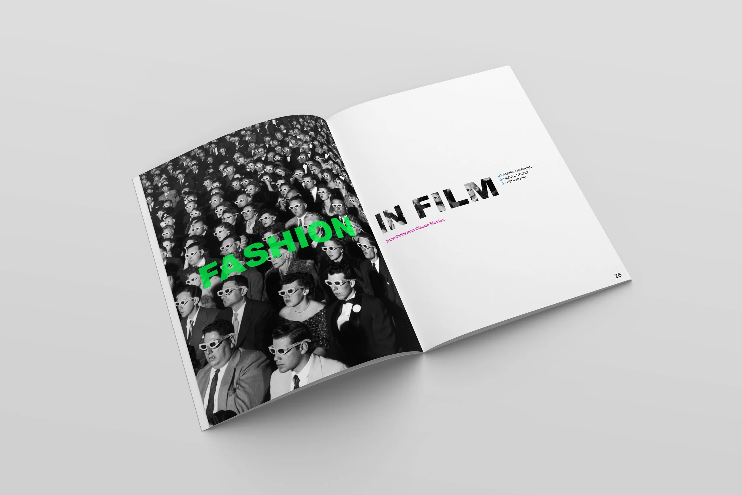
For my magazine, Stitch, I wanted to create a design that felt bold, high-contrast, and visually striking, blending gritty editorial aesthetics with an electric, modern twist. Every design choice—from the black and white imagery to the neon color palette—was intentional in creating a magazine that feels both raw and energetic.
I chose to use black and white images to bring a sense of grit, depth, and contrast to the magazine. This choice enhances the rawness and emotion of each photo, stripping away distractions and focusing on texture, expression, and movement. The monochrome imagery also gives Stitch a timeless, editorial feel, making the neon accents stand out even more.
To contrast the black and white visuals, I introduced neon pink, green, and blue as the magazine’s accent colors. Each color serves a purpose:
Neon Pink adds a rebellious, energetic, and almost punk-inspired edge, making the design feel bold and youthful.
Neon Green represents innovation, street style, and underground culture, tying into the magazine’s edgy aesthetic.
Neon Blue balances the intensity of the other colors, bringing a cool, digital-like glow that adds a futuristic touch.
These neon colors don’t just act as accents—they create a dynamic layering effect, highlighting key text, borders, and graphic elements. They also bring a sense of motion and electricity, making the magazine feel alive and immersive.